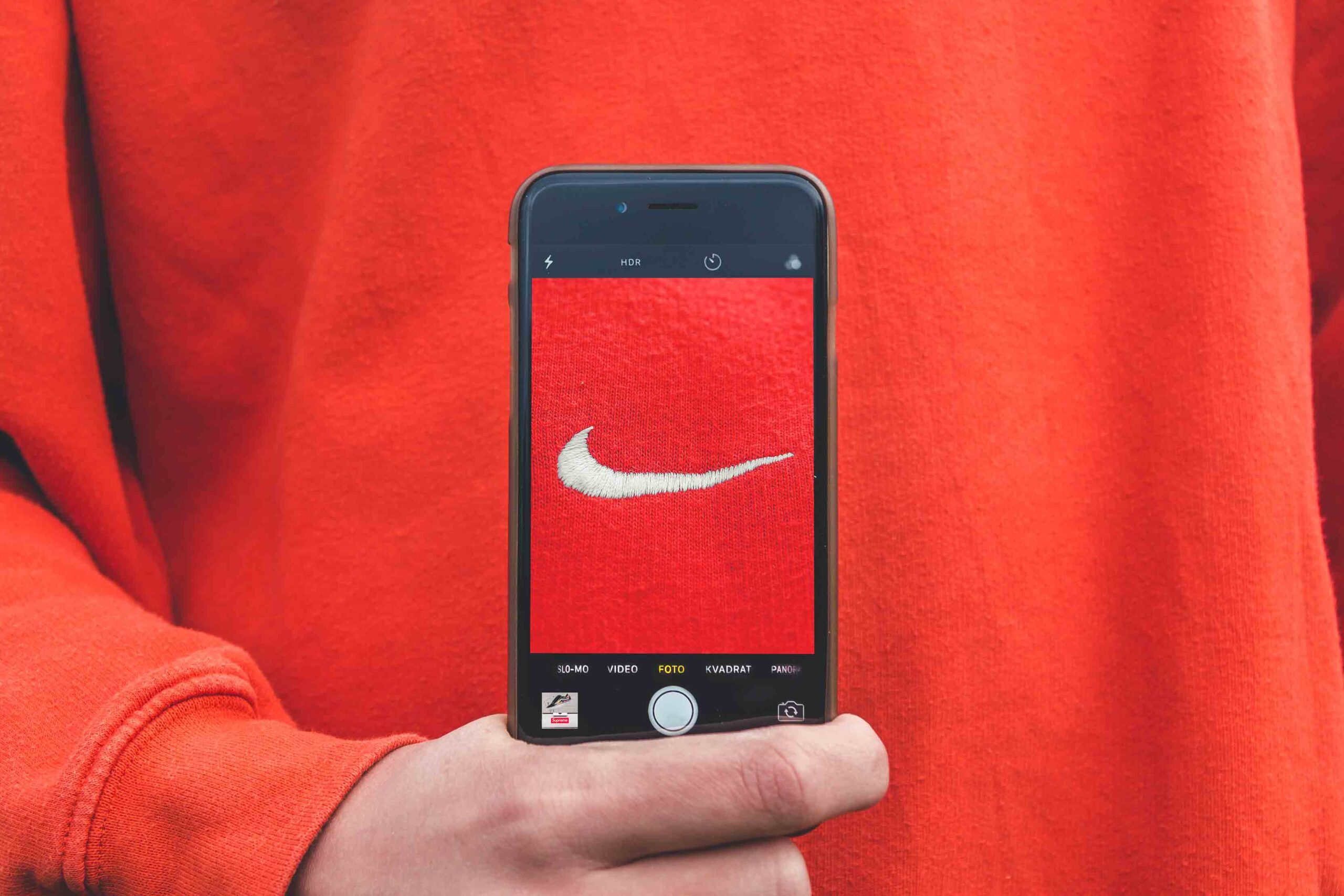
Typography Tricks to Improve Content Engagement

5 Type Tricks to Improve Engagement with Content

Try out these typography tricks to improve engagement with your content!

Grid It Out!

Use a grid to organize your design! Start by creating your preferred type of grid and then plot out exactly where all of your type and graphics are. Using a grid organizes your content in a way that allows readers to easily grasp your content.

Simplicity Is Key

Stick to one or two typefaces in your design. Overcomplicating your content with a wide range of typographic styles distracts from your message and makes your content harder to read. Be sure to use decorative fonts sparingly, and never in the body of your text.

Break It Up!

Use headers in a different size and weight to break up long body copy. This helps readers scan your text to find the exact information they need. You can also include bullets to break up dense lists into easily-understood concepts.

Create Contrast

Make sure that the color and brightness of the font is different enough from the background to ensure readability. It’s important to consider all of the attributes of your typography, including size, weight, color, and opacity when establishing contrast. Avoid setting small, light type over a white background or dark type on a black background. When in doubt, opt for more contrast rather than less.

Less = More

Too much type in a layout can discourage readers from absorbing all of your content. Long, unbroken body copy can make your design appear cluttered and disorganized, so ensure that there is plenty of negative space in all of your layouts.

Even if you’re not a designer, there are a lot of simple ways to improve the way you help your copy shine through the use of smart type design. If you follow these simple typography guidelines your content will improve, and so will engagement with it.

Cait McGinnis